A familiar living room, washed in quiet beige, can begin to blur into the background of daily life. Light streams across pale walls and blends with the soft grains of wood, creating an inviting yet unremarkable scene. But what if a single, well-placed stroke of bold blue could shift everything—without the upheaval of renovation?
Why Neutral Interiors Lose Their Spark
The calm of neutral tones—beige, off-white, natural wood—offers comfort but can flatten a space into sameness. Over time, the absence of contrast leaves the eye wandering, unfocused. In homes renovated for simplicity, the intention is harmony, yet something vital often goes missing: a sense of memorable presence.
Introducing the Theory of Unexpected Blue
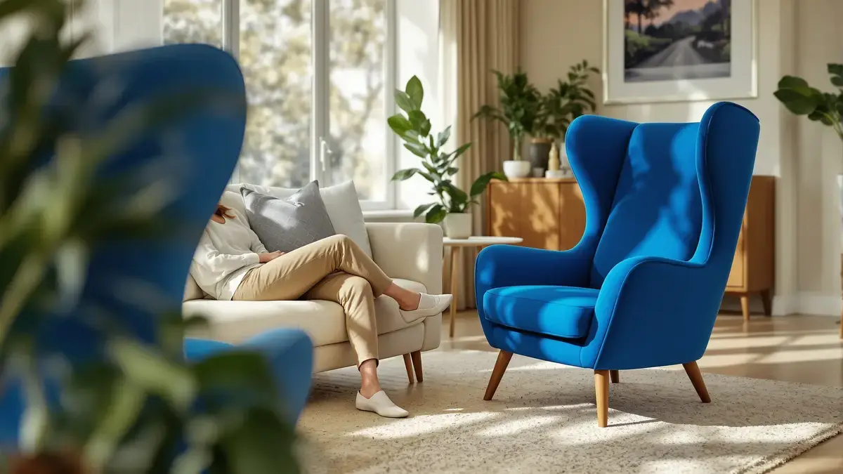
Rather than repainting or rebuilding, one idea quietly disrupts the routine. The Theory of Unexpected Blue borrows from a concept that originally favored red: inject a bold accent into a peaceful environment. This time, blue takes center stage. A cobalt chair or Klein blue trim commands attention like a spotlight on an empty stage, inviting new energy into the room.
Blue’s Unique Psychological Effect
Where red can jolt or overwhelm, blue settles. Studies link blue with calm, stability, and the feeling of trust—qualities that sink into everyday routines without demanding too much. Globally, blue remains a favored color, tolerable over time, and unlikely to tire the senses. It manages to be both modern and timeless, soothing yet visually assertive.
One Color, Infinite Impact
In practice, the approach is minimalist. The goal is not to scatter blue accents but to create a striking focal point. This could be a vibrant armchair in the living room—iconic and impossible to ignore—or a deep blue door that lures visitors further inside. Beiges and woods remain the canvas; blue is the punctuation.
Room-by-Room Application
The hallway’s sequence of midnight blue doors forms a discreet path of color through otherwise muted ground. In bedrooms, sky blue or blue-grey soothes, gently encouraging rest. Work areas or reading nooks can benefit from inky blue, a subtle nudge toward deeper concentration. The technique is simple: one standout blue, carefully chosen, rather than many scattered fragments.
What to Avoid for Lasting Style
The mistake lies in excess—too much blue, or too bright a shade in a shaded corner, can disrupt harmony. Blue gets lost when buried under clutter or forced into already busy walls. The safest bet? Begin with things that are easy to switch out: a lamp shade, mirror frame, or cushion. Let the blue element function as a clear visual pause in the room’s ongoing story.
A Subtle Transformation, Visible to All
The theory rests on subtlety. A single blue accent serves much like a line of poetry in ordinary prose, slicing through monotony with intent. The transformation happens in a glance; the space breathes deeper. No construction required, no upheaval—just a shift in the color’s role.
A change in atmosphere need not demand grand gestures. Sometimes, it’s the attention paid to a single detail—a bold blue, expertly placed—that creates the strongest impression. As interiors grow more uniform, this simple method stands out by doing less, but accomplishing more, inviting both calm and character into everyday life.