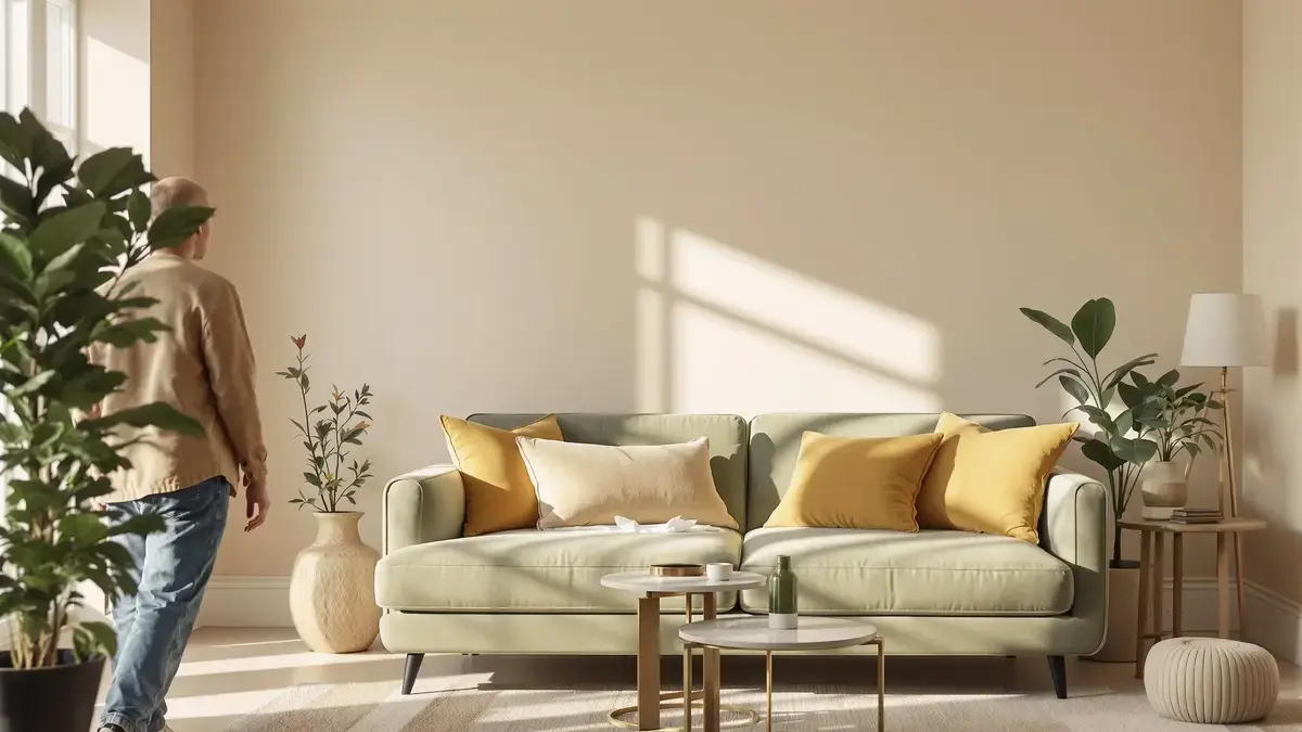
You walk into a freshly painted living room. The walls are a gentle beige; a velvet sofa in deep green invites you to sink in. A few cushions and a brass lamp catch your gaze, adding a spark of character. The room feels balanced, calm, as if it exhaled just before you entered. But this sense of harmony is no accident—and without it, the space can slip into chaos.
The Invisible Formula Behind Calm Spaces
In 2026, the rule of 3 colors becomes the quiet backbone of inviting living rooms. At its heart is a simple mathematical balance: 60-30-10. Sixty percent is your dominant color—think of broad walls, expansive rugs, or even the floor beneath your feet. These dominant hues are nearly always subtle and neutral: linen beige, pearl gray, light taupe, soft brown. As backgrounds, they grant a gentle continuity.
Your eye finds rest in these shades, leaving room for other tones to stand out. Interior designers—and increasingly, neuroscientists—point out that the brain craves visible order. When the main color quietly sets the stage, the rest of the space can breathe.
Why Two Colors Aren’t Enough
Try splitting your space half and half. Maybe you’ve seen thick stripes of bold color on opposite walls or two contrasting sofas facing each other. Instead of harmony, there's confusion—your gaze jumps from surface to surface, untethered. When proportion is neglected, even the most tasteful palette struggles. Visual hierarchy matters: base color equals unity, the second adds depth, and accents bring moments of surprise.
Applying the rule means accepting that not all colors should be equal. The dominant color is the room's heartbeat; the secondary, its character.
Secondary and Accent Colors: Shaping Personality
Thirty percent of the room is reserved for a secondary color. These become your statement pieces: a sage green sofa, night blue curtains, a signature terracotta rug. Paired thoughtfully, they offer visual contrast and anchor the space. A bold accent wall can make a room memorable, but without the supportive calm of a dominant base, it can overwhelm.
The remaining ten percent creates a spark. Accent colors: perhaps mustard yellow cushions, a frame in deep black, a glint of brass. These details draw the eye purposefully, creating focal points. Arranged without excess, accents become the room’s punctuation marks, guiding rather than shouting for attention.
The Science of Feeling Good Indoors
The principles behind this balance aren't only aesthetic. Neuroaesthetics reveals that our brains are wired to recognize order and seek structure. Spaces that respect proportion feel larger and smoother to inhabit. Too much of a single strong color—four red walls, a matching sofa—can shrink the room and bring heaviness, the so-called “box effect.”
Including large colored furniture in your calculation changes the outcome. A bright blue couch, for example, belongs to the 30%, not as an accent. Overlook this, and the atmosphere shifts.
2026 Palettes: Nature, Sun, and Chic Graphics
Color trends for 2026 point to subtle natural rhythms. Picture a living room grounded by 60% linen beige, energized by 30% sage green, then finished with flashes of deep black or glowing brass. Alternatively, imagine warm off-white walls, a terracotta rug underfoot, and small details in olive green or petrol blue.
Another option leans graphic: smooth pearl gray overtakes the space, with night blue playing a dramatic secondary role, and mustard yellow leaving small notes of energy.
Test Before You Commit
Before choosing, observe how color shifts through the day. Light sneaks in from different directions, transforming a perfect paint sample into something unexpected by evening. Experts recommend using painted A4 cards, positioned in changing light, to witness these changes—what designers call metamerism. It's a practical step, not just advice for perfectionists.
Don’t forget the immovable pieces: floors, woodwork, that colorful armchair you love. Add these into your calculation, let the final palette surround them rather than fight against them.
Beyond Numbers: Emotional Architecture
The 3-color rule isn't a rigid prescription, but rather a blueprint for comfort. When followed, it becomes a kind of emotional architecture. Each shade has its purpose: the base holds the mood, the secondary adds personality, the accent offers connection. Done carefully, it all falls into place—sometimes almost invisibly.
Done poorly, the absence is just as real: visual confusion, restlessness, a feeling that something is not quite right. Modern living rooms can be many things, but the ones that invite you in share a certain quiet order—an order shaped, often silently, by a simple arithmetic of color.